 Jason Edmiston
Jason is a commercial illustrator since 1996. He has created many pieces of for advertising, editorial, packaging and book publishing clients intentionally. He paints in acrylic on watercolour paper or wood panels. His work fantastically ranges from realism to exaggeration. Some of his clients include: Coca Cola, Hasbro, Kraft, Nestle, Nike and many more other clients. He has won a range of awards for his amazing and intriguing illustrations; his awards are:

- 2012: Society of Illustrators Los Angeles 50 (4 Awards)
- 2011: American Illustration Annual Selected
- 2011: American Illustration Annual Chosen
- 2010: Society of Illustrators of Los Angeles 48 (Bronze Award Gallery)
- 2010: Society of Illustrators of Los Angeles 48 (2 awards)
- 2010: American Illustration Annual Selected
- 2009: Spectrum 16: Contemporary Fantastic Art Annual
- 2008: American Illustration Annual Selected
- 2008: Communication Arts Illustration Annual
- 2008: Applied Arts Illustration Annual
- 2007: American Illustration Annual Chosen
- 2004: American Illustration Annual Chosen
- 2004: Applied Arts Illustration Annual
- 1996: Studio Magazine Illustration Annual
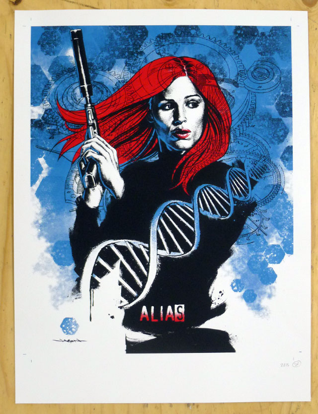
His realistic use of colour, tone, amazing detail and accuracy has led him to produce these heart stopping pieces of work which have been recognised with his many awards. ^^
 In his work he uses uses: Tone, Colour, Form and Texture. He uses a variety of different tones in his artwork to ensure that his form is presented well and he can show the basic and complex elements of dark and light in his realistic twist of artwork. In addition to this he uses a variety of colour in his work, sometimes sticking to a certain colour palette to suit the requirements of his aimed client and what he is presenting. When producing his work he adds elements of form; he works in 2D but with his great use of tones he adds an elements of 3D form to his artwork. Furthermore to this, he adds a textured look to his work, i.e: skin texture, watercolour, hair..etc. In doing so he works in an ordinary 2D form which makes it even more amazing how he produces such a good element of texture to his work with the use of acrylics.
 In relation to my rubix cube work, I think that his work uses realistic elements; whereas my work lacks that ever so slightly. However, I feel as though we both have presented tone, although his is in a more complex form than mine. In relation to my etch a sketch work, his and my work is very different. He uses a lot of tone, colour, form and texture in comparison with my etch a sketch work, mine is very simplistic, uses bold blocks of colour, small detail with the use of words and only focuses on one main object.
No comments:
Post a Comment