Herbert Matter
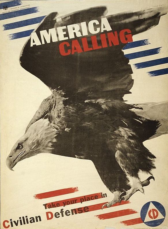
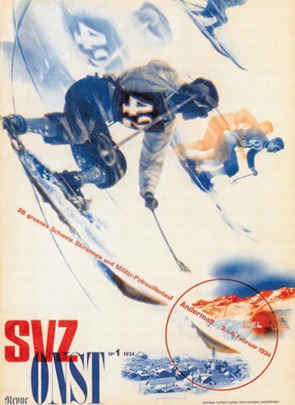
Herbert Matter was a Swiss-born American photographer and graphic designer known for his use of photo montage in commercial art, in which he would manipulate shape and scale to create visually intriguing and eye catching work for his clients. He did this by cutting out images and placing them on top of one another, which we could now do using Photoshop without the use of materials in front of us. In 1925 - 1927 he studied painting at Ecole des Beaux Arts, Geneva. And from 1952 - 1976 he was a Professor of Photography at Yale University. He influenced a lot of people with his abstract photography. Some of his clients included: The Swiss Tourist Office, Swiss National Pavilion, Container corporation of America (CCA), Arts & Art architecture magazines, Fortune magazine, Vogue. I think the main characteristics of the formal elements which stand out to me are, colour - In a lot of his pieces such like the one on the right (the eagle piece), it uses minimal amount of colour, focusing on red, white and blue which relates of what it is talking about (America). Another characteristic I have noticed in his work is tone, In the one below on the left, it uses some tone which adds to the effect of the skiers moving. A quote of Herbert Manner's was: "If you love something, the work will be just fine."


 Evaluation

This is my Herbert Matter response for promoting South sea Skate park. For the process of making this I started off with searching and gathering some images which I could use to promote South sea skate park, I searched for images of south sea skate park and went on from there. I then thought about things which would relate to a skate park and began to search images of skateboarders and bmx tricks. I transported my images into Photoshop; using the 'Magnetic Lasso Tool' I was able to go around the images, cropping them the shape which I required for my response. After editing the images the way I wanted by adding the Magnetic Lasso Tool, I was able to edit them further by changing the Opacity and the placement of them on the page. My work relates to Herbert Matter's work because I have used multiple individual images to place onto one original image and changed the size, opacity and arrangement on the page. Herbert did a similar thing by changing the scale of his photos which he used on his page, he also arranged his images ordinarily, placing theme in focus point on the page making it stand out; which is what I have also done. The health and safety which I had to consider when producing this was: Taking breaks away from the computer screen to rest my eyes; ensuring that I didn't cause myself eye strain, adjusting my seating position which included corrected my seat to make sure I was comfortable in my seat and did not produce any aches or pains in my back.
 |
| My Herbert Matter Response |
The formal elements I have used are: Colour - I have used multiple uses of colour which are shown in my images which I took off from the internet. Tone - I have tried to experiment in the use of Photoshop by changing the opacity of the images which has created them to fade. Form - I have used many different layers to achieve the 2D effect of the images. Shape - I have used the shape of the images to my advantage (By using the magnetic Lasso tool to cut around the area of the image which I wanted) by applying them onto my page in a neat form.


No comments:
Post a Comment