Wednesday 9 December 2015

Lucian Bernhard

Lucian Bernhard
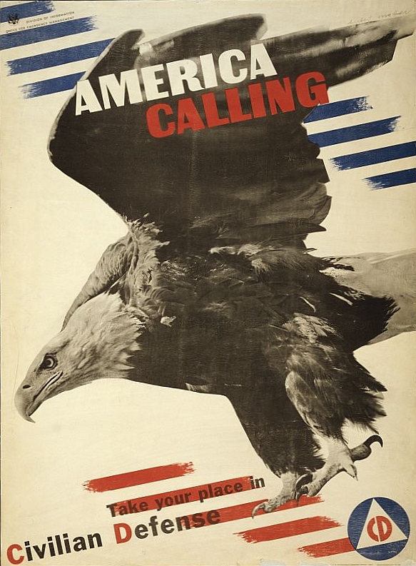
Was a German graphic designer, professor, interior designer, type designer and artists during the first half of the twentieth century. He was very influential in the stylish work such as, Plakatstil. He was mostly taught by himself. He uses a bold sense of shapes, almost quite abstract like in the use of his simple shapes and smooth style, he also makes sure to use some 3D aspects in his work, by adding tones in some of his designing work, he also has used a minimal colour palette; limiting his colours to 3-4 for some of his work. I have found a quote of his - "You see with your eyes, not your brain", this means that you should base what you like or dislike by what you feel when you look at it not what other people think about it.

My finished interpretation of Lucian Bernhard's style

^^I have produced my own response to Lucian Bernhard's work^^   I started off with looking for a shoe image; saving it and opening it up into Photo shop. Once I had done this I was able to use the 'Magnetic Lasso Tool' (Because of the white background in the image I could of used the 'Magic wand' as a more professional tool rather than the 'magnetic lasso tool'). and drew around the shoe and hiding the white layer behind the image. I was able to save it as a PDF file and 'place' it into Illustrator. Once I had done this I selected the image and 'image traced' it and was able to select the 'colour' option and decide between how many colour I wanted to use out of the choice between 2-30 colours. I selected the colours I wanted and then went onto the typography part, by typing in 'Converse' (the make of the shoe) I was able to select the style I wanted; after looking through all the different stylish fonts I decided to use 'Times New Roman' and making it bold. I then was able to add another layer and select a background colour which would fit in with the font and shoe colour; making sure not t contrast with them. I chose a light blue as I thought it didn't contact with the black shoes and dark blue typography. My first attempt at this it didn't work when changing the colour for the images background when I attempted to 'Expand' it as the white shoe laces bled in with the white image background so I changed it around a bit and changed it from 9/30 colours to 30/30 colours. I was then able to change the colour of the background without any problems. I have; like Lucian; used a limited colour palette, limiting it to only a few colours, placing a basic image into Illustrator; keeping the designs of it all simple; making the typography stylish and bold and making good use of my space on the page by enlarging the image and the typography.

Original Image which I selected
from the Internet


Monday 7 December 2015

Herbert Matter

Herbert Matter
Herbert Matter was a Swiss-born American photographer and graphic designer known for his use of photo montage in commercial art, in which he would manipulate shape and scale to create visually intriguing and eye catching work for his clients. He did this by cutting out images and placing them on top of one another, which we could now do using Photoshop without the use of materials in front of us. In 1925 - 1927 he studied painting at Ecole des Beaux Arts, Geneva. And from 1952 - 1976 he was a Professor of Photography at Yale University. He influenced a lot of people with his abstract photography. Some of his clients included: The Swiss Tourist Office, Swiss National Pavilion, Container corporation of America (CCA), Arts & Art architecture magazines, Fortune magazine, Vogue. I think the main characteristics of the formal elements which stand out to me are, colour - In a lot of his pieces such like the one on the right (the eagle piece), it uses minimal amount of colour, focusing on red, white and blue which relates of what it is talking about (America). Another characteristic I have noticed in his work is tone, In the one below on the left, it uses some tone which adds to the effect of the skiers moving. A quote of Herbert Manner's was: "If you love something, the work will be just fine."


Evaluation
Herbert Matter LogoThis is my Herbert Matter response for promoting South sea Skate park. For the process of making this I started off with searching and gathering some images which I could use to promote South sea skate park, I searched for images of south sea skate park and went on from there. I then thought about things which would relate to a skate park and began to search images of skateboarders and bmx tricks. I transported my images into Photoshop; using the 'Magnetic Lasso Tool' I was able to go around the images, cropping them the shape which I required for my response. After editing the images the way I wanted by adding the Magnetic Lasso Tool, I was able to edit them further by changing the Opacity and the placement of them on the page. My work relates to Herbert Matter's work because I have used multiple individual images to place onto one original image and changed the size, opacity and arrangement on the page. Herbert did a similar thing by changing the scale of his photos which he used on his page, he also arranged his images ordinarily, placing theme in focus point on the page making it stand out; which is what I have also done. The health and safety which I had to consider when producing this was: Taking breaks away from the computer screen to rest my eyes; ensuring that I didn't cause myself eye strain, adjusting my seating position which included corrected my seat to make sure I was comfortable in my seat and did not produce any aches or pains in my back.
My Herbert Matter Response
The formal elements I have used are: Colour - I have used multiple uses of colour which are shown in my images which I took off from the internet. Tone - I have tried to experiment in the use of Photoshop by changing the opacity of the images which has created them to fade. Form - I have used many different layers to achieve the 2D effect of the images. Shape - I have used the shape of the images to my advantage (By using the magnetic Lasso tool to cut around the area of the image which I wanted) by applying them onto my page in a neat form.


Tuesday 1 December 2015

Saul Bass

Saul bass and my responses

Saul bass was an American graphic designer and academy award winning film maker. He is best known for his advertising for film posters, title sequences and corporate logos. He designed some iconic corporate logos in North America.


These are my three responses to Saul Bass ------>


On the right is one of Saul Bass advertisements of the film "The Shining"---->
The characteristics of this which I have noticed are:

  • Line - For this poster he has used line in his use of font, making it very blocky and abstract. Creating a sense of boldness and over powering eye catching words.
  • Colour - Like in all of his work, he has used a limited amount of colours, the most noticeable colours presented are yellow and black; and some grey which is ever so slightly noticeable to the eye.
  • Tone - In the face in the letters, it presents some tone showing the light and dark areas of the face.
  • Form - It has been arranged in the form of 2D and the full title of the film has been placed in the middle, the most viewed part of the whole poster.
  • Shape - In the font of the letters, it is presented in a squished spacing and creating a blocked shape of the font and space used.

<----For this poster I have thoughts about the different formal elements which are -presented, these include:
  • Line - The font is very abstract and blocky, presented some fine lines giving a sense of character to the title itself. 
  • Colour - It uses a small amount of colour, only using red, black and white, making it simple but effective.
  • Tone - It uses a small sense of tone showing the dark and light shades of the phone.
  • Form - The use of the tone in the illustration of the telephone creates a sense of form and makes it look as though it is 3D from a certain perspective.
  • Shape - The telephone creates a smooth and neat shape with no out standing lines or blocky abstract lines creating a blocky shape. 
This poster is advertising the movie Star Wars, in the success of doing this he has used these characteristics:
  • Line - In the process of creating this he has succeeded in using neat lines to achieve the shapes in which he has produced. 
  • Colour - Like most of posters he used a limited amount of colour, sometimes only using 3 limited colours; but for this piece he has used four - black, red, white/grey and blue. In using these colours he has created a very good view of what he was aiming to advertise (which was star Wars).
  • Form - From the perspective of this it is easy to see that from the form and shape of the black shadow that it is in fact a main character in the film, just from Saul Bass's use of simple shapes and abstractness.
  • Shape - He uses simple shapes to achieve high quality illustrations which can be recognised as objects or characters. 
This poster is one for the film "Casino Royale", it's characteristics include:

  • Colour - It uses orange, black and white; which has worked very well, considering its only a few colours which were used to create it. 
  • Form - Although it doesn't use any tone, from the perspective of the hand it creates a 3D looking form although it used using 2D form.
  • Shape - He has been quite unique with the use of his shapes, creating them to be abstract like and simple; this creates one of the many elements of uniqueness to his work.
  • Tone - He uses a limited amount of tone for this particular poster but does achieve it many a time by thinking of the shades of colour adding some form to his piece.
  • Pattern - He does not use much pattern; it is very limited, however his pattern of the cards detail and the background are simple but effective.

<---- This poster is based on 'Back to the Future', it's characteristics of the poster are:
  • Colour - It uses a limited amount of colour, like many of his work, but the work fits with the particular elements of the illustration (such as: the flames).
  • Form - This is created in 2D but by the perspective of the flames it creates a 3D effect, making the flames stick out and look realistic on the page. 
  • Shape - He has thought carefully about the shapes which he has used, such as the shape and look of the title and the way everything has been formatted on the page. 
  • Tone - He has included some limited amount of tone, a light shade of black in the background putting a bit more emphasis on the written detail. 
  • Pattern - There is some pattern included in the illustration of the flames, which has also been included with some perspective showing it go off into the background.


This is a poster based on the film 'Vertigo', it's characteristics are:


  • Colour - It included a few colours which are common to what he uses in many of his posters, these are orange, black and white. 
  • Tone - It includes a minimal amount of tone shown in the detail of the white swirl marks and patterns made.
  • Form - It has been produced in 2D but made to look 3D from the use of perspective of the body and the pattern of the swirl behind the figure.
  • Pattern - He has created a very particular pattern in the hope of some integument from his clients.
  • Line - He has used a good use of line from the use of his font and his style of the figure illustration.
Evaluation 
He uses many characteristics in his work, his example: His work is based on simple yet effective ways of advertising films, he also uses a limited colour palette; this means that he only uses a limited amount of colours to create his work, in doing so it creates a simple and non - over powering effect. It is simple and in a few of his work which I have looked upon he uses a few particular patterns and techniques in achieving his final design of his original ideas of what he would produce. I have also noticed throughout his work he occasionally uses some tone in the colours which he has used, or made it look as though there is some tone between the different colours used; creating some 3D form looking perspective of the piece. Another characteristic which I have come across, is that he uses his spacing very well on the page, on most of his pieces he has made sure to make the title big and bold; made it to stand out and be noticed upon the little detail of the wording. This is a very good idea as it will attract it's viewers and made them notice the film title straight away before looking in at the detail of the film.

Saul's Career
Saul worked with many clients in his career as a film maker and graphics designer, in doing this he designed some of the most iconic corporate logos in North America. Some of his clients included: The Bell System in 1969, AT&T's globe logo in 1983, Continental Airlines in 1968, United Airlines 1974. A quote of his was - "I just want to make beautiful things, even if nobody cares". He was known for being creative, drawing constantly as a child. In 1940 he left college and began advertising until his first major break.

Evaluation of my response
For my first response ('Hound of the Baskerville') I started off with thinking of some relate table subjects to fit with the film which I could then create onto paper in my own interpretation. I came up with the idea to produce a magnifying glass with some foot prints - t relate to detective work. As I could only use 3 specific colour (Red, Black and White) I took time to think about what colours should be what, I decided that the red could be the foot prints, the black could be the magnifying glass, leaving the background to be white. I started off with drawing and cutting out the magnifying glass; as well as the polypropylene like material to act as the glass. I then stuck this onto the magnifying glass template. Before sticking these both down onto the paper I drew some red blood like footprints and added them to the page along with the magnifying glass which I had created. I then added the title and who wrote it and who it starred. My response is influenced by Saul Bass because it uses some characteristics of his own work, it uses simple and a minimal amount of colours, it uses abstract like font and illustrations and it uses up most of the page making it stand out. I worked safely by being careful with scissors, keeping my work space clean and taking breaks every now and then to rest my hands.


For my second response ('Frozen') I started off with thinking of something to do with frozen, the different aspects of the film which I could make of an illustration onto the page. I came up with the idea to produce Elsa's (main character) arm and some snowflakes. I started off with getting an image of her arm and started to draw, cut out and glue onto the page (black background) and then I began to construct a snowflake and cutting it out and sticking it onto the page. I decided to produce her arm white, the background black and the snowflakes to be red. I then added some cut out letters spelling out frozen. Adding something extra I added some cut out letters spelling out 'based on the snow queen'. I think that my work is influenced by Saul Bass work because I have again used minimal amount of colours, used a simple illustration to explain the film in my own interpretation and I have added a view of it clearly on the page taking up the page but making sure it is simple but effective on the page. I worked safely by keeping my work space clean and tidy from clutter, being careful with the use of scissors and having a rest to be sure not to give my hands a rest.

For my third response ('The Hunger Games') I started off with thinking of a theme to do with the film, helping me to come up with an illustration to produce based on the film. I came up with the idea to start off with a black background, and producing a bow and arrow in red; with someone holding it - doing this using white paper. I started off with drawing and cutting out the bow and arrow (which was very fiddly) and then drawing and cutting out the arm and the hands separately, and placing them how I wanted on the page. My work is influenced by Saul Bass because I used basic illustration ideas to produce my final idea, it uses the space of the page quite well and creates a type of abstract form of the illustration. I worked safely by making sure to give my hands a rest every so often so they didn't start to ache and course pain, when using the scissors I used them carefully and sensibly and I kept my work space clean, away from any clutter.