Thursday 10 March 2016

Specialist Pathway

Visual Arts
This is a leaflet which I produced, which talks about Pop Art, t
he different artists involved in the movement,
what Pop Art is, opinions on Pop Art...etc.
Textiles
This is my shoe work which i produced in my sketchbook, this page presents
all the different techniques and medias I used when
producing my observation studies of different shoes.
Graphics
n this picture is one of my pages of which I
produced a graphics cityscape piece of work.
This shows development from an image off of the
internet; into my own developed piece of graphics work.

Textiles

Textiles
Textiles 

Textiles


Textiles

Textiles
Surface Design
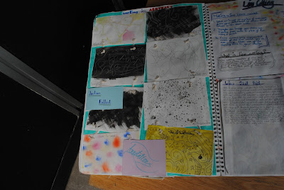
This page presents some of my surface design work which i produced, for
 this I produced some observational drawings of
some different objects using different types of pens.


Visual Arts

Graphics


Surface Design 
Graphics

Textiles


Surface Design
This is one of my responses to the Timney Fowler partnership of the artists
Sue Timney and Graham Fowler. i produced two responses,
in which I created in biro pen


Surface Design
Surface Design
Visual Arts
Graphics


Textiles
Textiles
Graphics

Surface Design
This is one of my surface design pages I produced which
presents my artist research for Rob Ryan. I produced a paper cut
response (top left) for his work. 

Textiles


Graphics

Graphics

Graphics

Graphics

Graphics


Graphics

Graphics

Graphics
These are my mini A5 testers of my final rubix cube final piece. i created a few
different changes to my final piece idea and experimented a little; creating little
testers.

Graphics


Surface Design
This is my final piece for my surface design project, I piece
is based around two techniques consisting of etching and sewing. The design
is based an observation drawing that I produced at the Natural
History museum.

Graphics
Surface Design
Surface Design


Surface Design


Visual Arts
This is my page of primary drawings of shoes, I produced
 these using a few different media; such as: soft pencils, watercolours,
pen and water and pencils. 
Visual Arts

Visual Arts
These are my different shoe ideas based on my chosen sub culture
Hip Hop, this was for my sub culture shoe brief. Overall, I produced
8 sketched ideas.
Visual Arts


Visual Arts

Visual Arts

Visual Arts

Visual Arts
This is my trial final piece and a little explanation of the useof  the gallery
space I will need if I was to ever display my final piece. 


Visual Arts
This is my complete developed final piece for my visual arts
 Iconic Shoe artwork.


Graphics
Graphics


Graphics
Graphics (Left) Surface Design (Right)
Subculture Evaluation - 
The purpose of the brief was to create a shoe design based on a chosen sub culture. My idea was to create multiple involvement of shoes and different medias within these design ideas. I created two blended shoe ideas, suhc as: my Doc Martin and High top combination shoe. My final piece was based on a combination of a hidden heal trainer and a high wasited boot. My combination of shoe ideas helped me to narrow down and decide my final design. Before producing these ideas I decided that my sub culture would be Hip - Hop. I chose Hip - Hop as I felt confident with the style and I know different elements of Hip - Hop I produced my ideas based around Hip - Hop , from the use of colour and images of different things associated with the style. I have tried to consider many of the different formal elements including, colour - I used colours which relate to the style and theme of Hip - Hop, texture - with the use of newspaper i was able to create a rough and layered texture and form - I kept my form to 2D, leaving it flat on cartridge paper. The materials I used to make and prodcue my final piece were nespaper, images from the internet, watercolours, fineliner pen and water. I decided to use these materials as I wanted to use famaliar materials which I had also experimented with using my design ideas. The techniques I used was starting of with ripping up piece of newspaper and sticking them down; then beginning to stick on the images; painting on the watercolours over the top; adding my pen drawing of my shoe and then using water to spread out the fineliner ink. The materials that I used helped to give the effect of layers and build up of textures with the use of the different materials I used. The technique I used gave this effect, if it was done differently it may have been layered differently; creating a different effect. I feel that my work is successful because it combines multiple techniques, such as: Layering, painting, sketching. It also uses a minimal amoutn of colours with the use of watercolours; and colour in the images. The use of drawing in a black fineliner creates a bold effect, making it stand out, which I think has made my work very successful. I made a small change when in the process of creating my final piece. The change i made was to use watercolours, i wasn't going to originally but then i decided it would emphasis mu shoe more when put behind my drawing. I feel as though my work meets the requirements of the brief in the way that it demonstrates Hip - Hop with the use of related colours and images, and the combination of two shoes to create an original Hip Hop style shoe. if my work was to be sketched for the exhibition, i think it would be best presented in the way of mourning. I would decide to use foam mounting, scale of A5 and it would be placed in the mid-view. This is how I think I would present my work. These choices are so that my work can stand with the use of foam mounting. The A5 scale is small, but will still stand out with the of bold outlines and colours. And in mid-view, it would be eye-level so you could look at it with it standing out and drawing your eyes to it. I feel as though my final shoe piece was very successful; it's colours relate with hip Hop, it stands out, it's unique, it's bold and it uses two different techniques combined, as well as my unique shoe design idea. However, my piece has let me down with it's small A5 size, which i feel as though would make a big difference to how it is presented and the blending of the images with the background and the pen and wash technique isn't very clear. Apart from these small negatives, my positives of my piece, overpower the negatives; making my piece very successful. I have recently decided to improve and develop from my original final piece. I decided to do this as I felt as though my first final piece which I originally did, was of poor quality; as of it's size and quantity on the page. Since, I have improved it greatly from my original final piece; from changing the size, to including many different painting techniques. For starting my improved final piece I started by prodcuing my newspaper collage onto a piece of A3 cartridge paper. I than began to add some dry brush techniques using different acrylic paint colours such as red, brown and blue. I then began sticking down the pictures and applying some dry brush and washing techniques with the acrylic paint. After stickingdown the images I had originally tried a couple of times to produce some image transfer techniques to my work but they were unsuccessful so I decided to go over the top with some of my other images which I had printed off from the internet. I added some splatter effects on the images and some other techniques such as: Mixing and blending the colours, blending, sponge effect, large detail with acrylic paint and layering using different materials (such as sugar paper). I then began to paint (which would be the background of my shoe) some white  acrylic paint onto the page, once dried I added some painted black detail. I wanted to keep some of my ideas from my original trial final piece so I decided to paint the shoe green, blue, purple and red (I had previously used these colours for the background for my trial piece as these relate to the theme of Hip Hop). The red was a development as to add some more brightness to the shoe and further colour. I also had the idea to create a slit effect, creating a window look, making the whole piece look as though it's four indivual pieces, I think this adds a bit more of a thought process to my work. I think that I have improved and deveoped from my previous final piece very well. This time around - due to idea to use the dry brush technique - I wanted to create a piece which was inspired by the work of Robert Rauschenburg as I had used a similar technique to his work. I think that I have definietey improved from my original final piece which is now my trial piece. I have added more images and enlarged them why overlapping them with materials and differentpainting techniques. I have also added colour to my shoe and created a windowed look. Overall, I feel as though my piece is very successful and fits in with the brief as I have prodcued an approprite subcultured iconic shoe artwork.

Collections Evaluation - 
For my brief I was asked to produce a textile design which would be used for wall coverings, seat covers, napkins, curtains and staff uniforms. We needed to produce a design; using  different materials, techniques and processes in order to help with producing multiple design ideas for us to come up with a final outcome. Based on the brief I decided to produce an etched shell pattern which is repeated, and has been sewed over the top of one of the shells - combining different media's and techniques. I think that my design is suitable and fits with the brief, as the pattern design is based on an observational drawing of a shell from the Natual History Museum, it is simplistic yet intrigueingand it fits in with the aspect of the Pitt Rivers and Natural History theme, which includes natural and collected elements. I think that it would work in a cafe space because it is a design that could work in multiple environments, especially a relazing and quite urban and natural area such as the cafe are in the Natural History Museum. In the cafe area I think that my design could be presented an seat cushions and napkins; I think this because I feel as though it is quite a simple pattern, but only to be used on smallamounts of fabric as the pattern many seem a bit crowded on seat covers, additionally; it may not match the theme of the museum, as my design is mainly purple. The materials I used to make my final piece were: Etching ink, etching plate, etching tool and thread. I developed onto my final outcome from an observational drawing I produced of a shell from the Natual History Museum, I then traced this using an etching plate and etching tool to carefull scratch away some of the etching plate's surface. Next, adding a few drops of water, I used the roller and etching ink to print my etched design to print onto the caolico fabric. After printing as much as I wanted onto the fabric, then finally, I began to start sewing over one of the printed shells. I feel though my final piece came out very well. The etched pattern came out very well on the caolico and the sewing was also very successful. However, the ink did smog a little but I feel as though this adds to the design a bit more and I hope this is clear.


Toy Fest Evaluation - 
Overall, I think my two final ideas worked very well and were successful. They were chosen based on them being the two strongest out of the three final ideas that I produced. If i could chosen one of my final ideas out of the three; I would choose my Etch a sketch idea. This decision is based on the opinions of my questionnaire people and how I felt about both of my final idea outcomes. I felt as though my etch a sketch idea was stronger between both my etch a sketch idea and my rubber cube idea; as it is very contemporary, a clear design, it is simple but it stands out and it is a clear design that isn't too bright and can appeal to all ages. Whereas, my rubber cube worked very well but once put onto the computer looked quite un-neat and a little unappealing; and because scanned it created the look of the watercolour texture which I think may have ruined the look of it on the computer. I think that if I was to develop the etch a sketch idea any further, than i would try out an animated version; with this it could sketch out the wording on the etch a sketch; like an etch a sketch would do - adding a realistic and different aspect - and other movement could be put in as well as this. I conducted a questionnaire, which I got good results from both people. I chose to question two people who had a big age gap so I could get a bit of a variety of answers of my different questions. I found that from the questions I asked; the 7 year old went for toys that made a noise, played with building toys and played with toys based on TV programmes. From the 20+ year old, they buy toys based on the educational and sociability side of toys, they have younger children and buy toys such as figurines and dollies. Further with my development of research I took images and produced research based on toys. I also experimented with different media which helped me to decide a media to use for my two final ideas. I think that my work meets the brief as it clearly presents the promotion of the 'London Toy Festvial 2016'. With that, it needing to fit with my target audience which is 3 - 10 years old. It uses minimal amount of colours which manage to catch your eye and draw you into the creative spure of advertising. Along side this, multiple artists which I research for my secondary research; have inspired me to produce ideas with their own outlook and view on art. The different styles helped and inspired me to think out side the box and try experimenting with different media and different styles and ideas; and developing these further to create stronger outcomes. There use of colour, shape, style and imagination helped me to create my own piece based on my inspired sketches, designs and ideas. I got my inspiration for my three final ideas from Kate Moross for my Rubix cube idea, Lucian Bernhard for my etch a sketch idea and Michael Craig Martin for my nintendo idea. Additionally, I used primary research to help me with my ideas. I created a lot of primary research which inspired me with a few of my ideas that i have produced. The box cube, etch a sketch and nintendo ideas were all based on primary research which I had produced. I wanted to make my work my own, and primary research helped me with achieving this and gave me something to work on; it being the foundation of my ideas which then developed onto more stronger outcomes. I think that my final outcomes fits the brief as they advertise the 'London Toy Festival 2016' perfectly and I feel as though they are very suitable and fit my target audience. They use suitable colour palettes which fit in with the design, use iconic toys on the poster which stand out and my poster design is unique and original; as my own design.

Graphics - Toy Fest Timeplan

Graphics
This is my final piece for my grpahics brief work, I have produced it in
a painted form which I then photogrpahed and added digital detail on Illustrator
and Photoshop.

Surface Design

Graphics (Left) Textiles (Right)

Textiles

Visual Arts
This piece was made using a fineliner pen and
water, this technique is called pen and wash. This is an
 observational study of a bicycle which was in
front of me.

Surface Design (Left) Visual Arts (Right)


Surface Design


Visual Arts (Left) Surface Design (Right)

Graphics (above this image - Textiles (Left) Graphics (Right))
Textiles
These pages are full of different textiles designs using feathers and
feather designs. The page on the lft shows the technique of
 making feathers with masking tape and the on the right page it shows
printed feathers on fabric.


Textiles


Textiles

Textiles
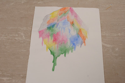
These are different techniques which can be used used using paint. These
techniques include dry brush, pen & watercolour, drippling...etc. 

Surface Design

Surface Design

Surface Design

Graphics

Visual Arts
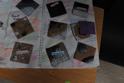
This is a cardboard piece which involves a coat of acrylic paint
and some images of the hard ripped up and stuck on. I used a
blending painting technique for the background on the cardboard.


Surface Design

Surface Design

Surface Design
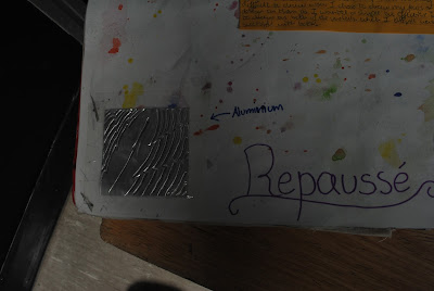
For this I created a few design ideas for my repausse piece of artwork,
I came up with two final designs and produced them on some Copper
and Aluminium. 

Surface Design

Surface Design


Textiles

Final Piece development plan

Final Piece development plan

Final Piece development plan

Final Piece development plan

Experimentations for final pieces

Experimentations for final pieces 

Graphics final piece

Graphics

Surface Design final piece
This is one of my pieces for The Hard brief, to make it I used a map collage and
a lino print of a ship design.
Textiles final piece
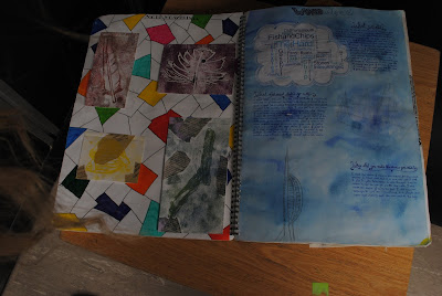
This is one of my pieces for The Hard brief, to make it I used a collage, watercolours
and pen. This is based on an image I took at The Hard of the Spinniker Tower.

Ship Evaluation -

We were asked to produce three images promoting The Hard. We had to ensure that it conveys a possible and understandable message to the Portsmouth public. And to present The Hard as a welcoming and hostile environment to live, work, eat and relax in. I decided to respond to this brief by referring back to the pictures I took from the Hard. I decided to do this as I had taken some positive and bright pictures to present The Hard in a good light. I started off with looking through my pictures which I took and chose 4 different pictures which I felt presented The Hard well and were interesting and nice to look at. I chose my pictures of the HMS warrior ship, a boat, the Spinniker tower and the pub - ‘The Ship Anson’. From these I developed them into 5 thumbnails (choosing to develop the picture of the ship, the boat and the Spinniker Tower. I processed these ideas into 5 ideas - a colour photo, edited photo, image in illustrator, zoomed in Version of the image and a repeated pattern of the image. I drew off from this and decided to produce and develop the ship picture into a lino print which I would go on to produce onto map, from the inspiration of the map collages I experimented with. I started off with tracing the picture from my drawing of the full picture of the ship onto the lino and began to carve away the unwanted amount of the lino. I was then ready for printing it onto a piece of map, I did this by using some navy blue blocking ink, by rolling it onto my lino and printing it straight onto the A4 piece of map - (Practising on a spare piece of paper). The formal elements which I used were Pattern - The map presents the detail of the road and land which acts as a strange pattern. Texture - from doing the lino print it has produced some rough texture and added a fuzzy effect and not a full block colour which adds to the originality. Colour - I decided to use only one colour for my lino print but I think that the effect of using the navy blue colour has been produced very well and looks very good presented on the piece of map. To make my lino print I used a piece of A5 lino, navy blue blocking ink, some tracing paper and a lino cutting tool. These materials and equipment helped me to achieve the final result which I produced. When making this piece of work I had to ensure that I was careful with the materials and Equipment that I was using; when using the lino cutting tool I had to be sure to carve away from my fingers and to hold the lino firmly to ensure that it did not slide around and cause any injury. I feel that I was very successful, I feel this way because the media of using blocking ink and map collage I think have worked very well together. During the process of producing this work I did not face any challenges but I feel that the challenges which I could have faced could have been no supply of lino which I would have to resort to another material, I could have pierced a hole in the lino which I would have to buy some more lino possibly result to another material. I feel that my outcome meets the brief very well as it presents the HMS Warrior in an interesting way, showing it in a different background and making it come across as an interesting and historic tourist attraction. I could have developed it further by possibly sourcing a further amount of lino and producing some other lino cuts based on some of the pictures which I took from The Hard. I could have also possibly developed my idea further and added further features - such as birds, fish and other things which I could show which related to the Hard.

Boat Evaluation - 
For this I was asked to produce a leaflet promoting the Hard in a positive and inviting way, for this I needed to produce an image which would show how the Hard is an inviting and welcoming place to visit. For this I decided to use a multiple amount of pictures which I used from the hard and use illustrator to help present the hard in a positive view and present all the variety of pictures into one big picture which would present the attractions in the hard all in one picture. I decided to respond by starting off to collage my page with magazine (my original idea was to produce a collage) and scan it to transfer it onto the computer. Then by going into illustrator I was able to import different images and change the opacity and arrangement of them. I decided to produce this as I thought that by only producing one picture and adding an edited version would be too original, unthrilling to the human eye. This gave me the idea to produce a range of pictures all in one, hopefully presented The Hard in a very positive view. My original idea was to produce a magazine collage from the drawing of the image which I took from the Hard; but I decided from already wanting to produce another type of collage; that I wasn’t going to repeat any type of technique. I had already started the collage so I decided to scan it and produce it onto Illustrator; by using the collage as the background layer and adding on top other pictures I took from the hard. I experimented with the magazine idea which I eventually developed into a illustrator background which has given off a textured effect which looks very original. I used a multiple amount of formal elements these include, Texture - The use of the scan of the magazine collage which I produced created a rough and uneven effect which has transformed my Illustrator piece and added some character to the piece. Colour - From the different images that I included has a lot of colour which I have faded a little and changed the opacity of the images to created a faded effect to help the pictures blend in with eachother. Pattern - The texture and overlapping of the magazine added a type of pattern creating some character and originality to by illustrator piece. And tone - The use of the coloured ripped piece of magazine adds some tone between the different colours that I used. The materials which I used for my original piece I was planning to produce were - pritt stick glue, card and coloured magazine. For my developed piece (illustrator piece) I used a computer (illustrator), I used layers, opacity, and other certain things which helped me to produce my final outcome. I feel as though I was very successful with my final outcome as it is an original piece that describes my own interpretation of the hard.  I had the challenge of choosing another piece of media which I had to change my collage into, although I did not stick with my collage idea which I had originally planned I used it for my illustrator piece. If money and time was not an issue I could had possibly trailed it before to get used to the use of Illustrator. I could have also tried some other processes (example: black and white).

Spinnaker Tower Evaluation -
 For this I was asked to produce a leaflet promoting the Hard, one of the pictures I took was of the Spinnaker Tower which was one of the final brief ideas. To respond to this I looked back through the book and noticed I would like to produce another piece based on a collage. I started off with the idea to produce a type of collage; whether it was a newspaper, magazine or map collage...etc. I produced some of the research on mixed media and decided to use newspaper, watercolours and a finaliser This then further developed into the big detail as the collage and paint (This was because the spinnaker tower and buildings had too much small detail to produce as a collage). And the rest which were not as a newspaper collage, stayed blank with a black finaliser to see the detail. I produced some experiments to help with my final outcome, my experimentations were a map collage, paint and newspaper and three artists interpretations. These widened my thoughts abut what kind of collage I would produce. The formal elements which I used for this collage were pattern - the effect of the text from the newspaper collages offs a sense of pattern of the whole piece. Texture - The overlapping of the newspaper creates a rough effect, by also looking at the newspaper collage it creates a textured effect. Colour - As I only collaged the bigger detailed parts of the image I used a minimal amount of colour, but by the use of keeping the Spinniker Tower and buildings white it has made them stand out and become more eye - catching. Line - From the use of a fineliner it creates a line effect which I think has been presented well. And lastly, Tone - The combination of he watercolour over the top of the newspaper collage has created a sense of tone, he use of the watercolours has creates some tone instead of a full block of colour. To make the Spinniker Tower collage I used A4 card, pritt stick glue, watercolours (some acrylics to help with the white clouds), a black fineliner pens and some scissors. I feel that this piece was very successful as the use of mixed media creates a sense of originality and boldens out the main attraction - The Spinniker Tower. I had to face the challenging decision of how to overcome the small detail of the Spinniker Tower, I overcame this by not collaging it and instead; leaving it pain and adding detail by using a fineliner pen. I think that my final outcome does fit the brief because I think it presents the Spinniker Tower very well and shows it as an interesting attraction. If money and time were not an issue I could have possibly developed a bigger piece of it, presented a bigger view and adding the small detail from the collage.

Surface Design final piece


Surface Design

Surface Design

Surface Design

Surface Design
These are my two tile pieces which I produced, the design is based on an
observational drawing of a shell. One presents just one shell lino print (right) and
the other one is a repeated lino print onto the clay (left)

Surface Design


Textiles


Textiles (left) Graphics (right)
Graphics (right) Visual Arts (left)